(Joined Data/SQL, Tableau Dashboard) The urgency of the research question lies in the dramatic rise of heat-related complaints in the Bronx during winter, compared to other NYC Boroughs.
The initial Research (My first Blog Post, February 2025), using the NYC 311 Service Request data, unfortunately did not provide enough data to confidently assess the key reasons for the considerable differences amongst the Bronx and the other Boroughs. However, it revealed that the Bronx’s heat complaints remained extremely high in both relative and absolute terms. To differentiate Final Project Research from the 1st Research, I expanded the 311 (no-) heat service requests to cover a much wider range. I also added 2022 NYC Census Data estimates to explore:
Question 1: How do different winter temperature patterns affect the number of complaints? (This point may be important if we could “forecast” the potential number of no-heat complaints during the peak winter period. Could pre-checking the heating systems of housing units initiated by the NYC Administration reduce the suffering of the people?)
Question 2: Do the expanded and enhanced datasets, which include 311 (no-) heat service requests and 2022 NYC Census Data estimates, provide policy insights into how we could better manage the heat-related challenges many Bronx tenants face every winter? These datasets form the basis for the policy recommendations presented in this report.
Please refer to the end of this post for a detailed explanation of the data and data sources I used.
NO-HEAT COMPLAINTS AND THE EMBIENT TEMPERATURES OF NYC:
The graph below shows the raw data and the number of daily (no-) heat-related complaints for New York City from August 2023 to April 2025. It is clear that:
- Many complaints are seasonal, where they rise dramatically during the winter.
- Still, the number of winter-season complaints differs significantly between the years.
- The number of daily complaints may be linked to the actual temperature of that day, although I could not observe clear patterns without looking at more data
Unfortunately, daily temperature data from a few years ago were not readily available, so I used monthly data to assess the relationship between ambient temperature and the no-heat complaints
IMPACT OF MONTHLY TEMPERATURE LEVELS AND THE NUMBER OF COMPLAINS, EXPLAINED BY BOROUGH
The chart below shows the dynamic interactions among variables: average monthly low—and high-ambient temperatures in New York City and the number of lack-of-heat-related complaints in New York City, broken down by Borough. Here, we can identify a few patterns, some more obvious than others.
There is a link between the ambient temperatures during the peak winter months of December to February and the number of peak complaints.
However, the pattern is also significantly influenced by the absolute level of temperatures during the peak winter periods. The number of complaints between November 2023 and February 2024 is considerably less than that from November 2024 to February 2025. This difference reflects that the winter of 2023-2024 was milder (warmer) than the winter of 2024-2925, temperature-wise.
COMPLAINTS FROM THE BRONX INCREASE MORE THAN OTHER BOROUGHS DURING THE WINTER PEAK MONTHS:
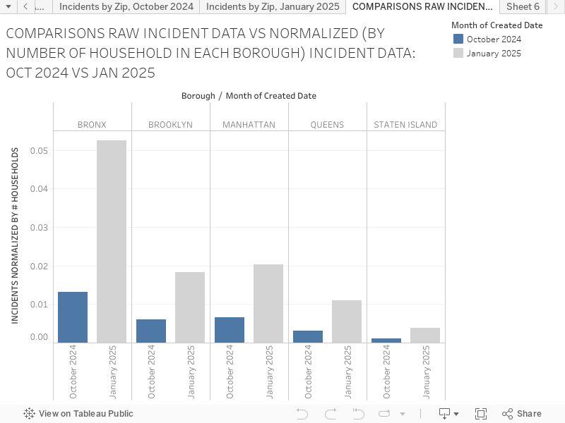
The animations of how specific zip code sections of the Bronx show noticeable increases identify the exact zip codes of that Borough that appear to have a particular rise in heat complaints during December to February. The pattern is stronger when we consider the complaints per household. (The household data are obtained from NYC 2022 Census Estimates and linked to the 311 Heat Complaint data via corresponding zip codes.)
During the winter seasons, we see dramatic rises in heat-related complaints in several zip-defined regions in the Bronx and, to a lesser degree, in Brooklyn, resulting in a much heightened share of complaints from these two Boroughs, as seen from the chart below.
PRIMARY CAUSE OF THE DRAMATIC, COMPARATIVELY HIGH HEAT-RELATED COMPLAINTS IN BRONX AMONGST THE FIVE BOROUGHS APPEARS TO BE CAUSED BY A DOZEN OR SO HUGE APARTMENT BUILDINGS.
One of the most relevant causes of the relative rise of the complaints from Bronx during the peak winter months appear to come from the role dozen or so apartment buildings in Bronx play, as seen from the building specific complaints for the entire five Boroughs: the significance of the building particular complaints appear clear from the two charts. The third chart in this paragraph is the reference point that shows the building-specific complaints during the fall 2025 (Sept-November), illustrating the prominence of buildings with many complaints during the peak winter months of December to February. The data show that most apartment buildings with the most frequent complaints are in the Bronx.
Please note that the addresses of the buildings are deliberately hidden, as the intent of this Research was not to identify specific buildings.
POLICY IMPLICATIONS OF THE FINDINGS
There are two realistic implications of analysis with substantial policy implications for addressing heat complaints and reducing the sufferings and/or inconvenience, IF these measures have not yet been implemented:
No doubt the NYC authorities understand the relationship between the winter temperatures and the number of complaints. Still, our analysis has discovered that even the minor changes in average temperatures between the 2023-2024 and 2024-2025 seasons resulted in a difference of tens of thousands of heat complaints. The importance of, and frequent updates for, the intermediate-term weather predictions with a few to several weeks’ horizon can better allocate required resources in advance.
The data have identified the buildings with the highest number of complaints. In-depth analysis of the “most frequently complained” buildings shows some overlap between the 2023-2024 and 2024-2025 winters. The authorities could set up a schedule of pre-inspections before the start of the winter for those buildings to reduce the possibility of frequent repairs during the winter. These pre-season inspections, arranged during the summer and the fall, could also reduce the repair bottlenecks that arise during the winter.
My original project involved only six months’ worth of data (heat-related complaints from October 2024 to a part of March 2025), obtained from the Open Data NYC 311 Complaints record. I have expanded the data set to 2 years, to include the longer-range comparisons covering at least two winters, to see if the milder temperature during the winter of 2023-2024 impacted the heat complaints relative to the harsher 2024-2025 winter season. (Yes, cross country running from December 2024 to March 2025 has been challenging!)
311 Service Requests from 2010 to Present | NYC Open Data
I was also looking for detailed demographic information for each Borough. The Census data of New York City that we used in the class was convenient. I created the comprehensive data by connecting Heat-Complaint Data with the Census Data using the zip codes to connect the two data sources.
ADDITIONAL EXPLANATION REGARDING DATA USED
My original project involved only six months’ worth of data (heat-related complaints from October 2024 to a part of March 2025), obtained from the Open Data NYC 311 Complaints record. I have expanded the data set to 2 years, to include the longer-range comparisons covering at least two winters, to see if the milder temperature during the winter of 2023-2024 impacted the heat complaints relative to the harsher 2024-2025 winter season. (Yes, cross country running from December 2024 to March 2025 has been challenging!)
I was also looking for detailed demographic information for each Borough. The Census data of New York City that we used in the class was convenient. I created the comprehensive data by connecting Heat-Complaint Data with the Census Data using the zip codes to connect the two data sources.