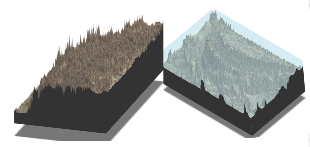
(R, R Coding) Side-by-side 3-D map comparisons of the Himalayas’ mountain ranges and the Mariana Trench’s abyss help us recognize the objective assessments of the planet Earth’s fascinating geographical features.
FIRST, A FEW TECHNICAL NOTES: R packages “raster” and “rayshader” are used to create the eye-opening maps. The GEBCO dataset provides the detailed bathymetric data (for the Mariana Trench), and the elevation (above sea level, for the Himalaya Mountains) from NASA SRTM. Fortunately, the highest and lowest locations on Earth are located on similar latitudes, meaning the projected map distortions of the two regions are broadly identical, making the visual map easier to compare. Also, please note that the magnitude of elevation/bathymetry is exaggerated 10 times the actual value to emphasize the visual differences.
My thanks to Mr. Samuel Ohana Grainger of the CUNY Graduate Center for the guidance and encouragement that helped me embark on this fascinating journey.
THE 3-D VISTAS OF THE HIMALAYAS AND MARIANA TRENCH: The actual 3-D maps (the Right map shows the Himalayas, and the left map shows the Mariana Trench, followed by sample R codes that produced the maps).
AMAZING DISCOVERIES (TO ME!):
Mt. Everest is not a lone high peak, but rather a prominent part of the majestic and vast Himalayas “plateau”, the entirety of which is situated at an extremely high elevation.
The Mariana Trench is not a deep hole in the flat seabed, but more like a series of colossal underwater mountain ranges. (Notice that a few isolated locations represent relatively tiny islands above the water level.)
THE HIMARAYA MOUNTAIN RANGES (x10 ACTUAL ELEVATION) THE MARIANA TRANCH (x10 ACTUAL DEPTH)
(Joined Data/SQL, Tableau Dashboard) The urgency of the research question lies in the dramatic rise of heat-related complaints in the Bronx during winter, compared to other NYC Boroughs.
The initial Research (My first Blog Post, February 2025), using the NYC 311 Service Request data, unfortunately did not provide enough data to confidently assess the key reasons for the considerable differences amongst the Bronx and the other Boroughs. However, it revealed that the Bronx’s heat complaints remained extremely high in both relative and absolute terms. To differentiate Final Project Research from the 1st Research, I expanded the 311 (no-) heat service requests to cover a much wider range. I also added 2022 NYC Census Data estimates to explore:
Question 1: How do different winter temperature patterns affect the number of complaints? (This point may be important if we could “forecast” the potential number of no-heat complaints during the peak winter period. Could pre-checking the heating systems of housing units initiated by the NYC Administration reduce the suffering of the people?)
Question 2: Do the expanded and enhanced datasets, which include 311 (no-) heat service requests and 2022 NYC Census Data estimates, provide policy insights into how we could better manage the heat-related challenges many Bronx tenants face every winter? These datasets form the basis for the policy recommendations presented in this report.
Please refer to the end of this post for a detailed explanation of the data and data sources I used.
NO-HEAT COMPLAINTS AND THE EMBIENT TEMPERATURES OF NYC:
The graph below shows the raw data and the number of daily (no-) heat-related complaints for New York City from August 2023 to April 2025. It is clear that:
Many complaints are seasonal, where they rise dramatically during the winter.
Still, the number of winter-season complaints differs significantly between the years.
The number of daily complaints may be linked to the actual temperature of that day, although I could not observe clear patterns without looking at more data
Unfortunately, daily temperature data from a few years ago were not readily available, so I used monthly data to assess the relationship between ambient temperature and the no-heat complaints
IMPACT OF MONTHLY TEMPERATURE LEVELS AND THE NUMBER OF COMPLAINS, EXPLAINED BY BOROUGH
The chart below shows the dynamic interactions among variables: average monthly low—and high-ambient temperatures in New York City and the number of lack-of-heat-related complaints in New York City, broken down by Borough. Here, we can identify a few patterns, some more obvious than others. There is a link between the ambient temperatures during the peak winter months of December to February and the number of peak complaints. However, the pattern is also significantly influenced by the absolute level of temperatures during the peak winter periods. The number of complaints between November 2023 and February 2024 is considerably less than that from November 2024 to February 2025. This difference reflects that the winter of 2023-2024 was milder (warmer) than the winter of 2024-2925, temperature-wise.
COMPLAINTS FROM THE BRONX INCREASE MORE THAN OTHER BOROUGHS DURING THE WINTER PEAK MONTHS:
The animations of how specific zip code sections of the Bronx show noticeable increases identify the exact zip codes of that Borough that appear to have a particular rise in heat complaints during December to February. The pattern is stronger when we consider the complaints per household. (The household data are obtained from NYC 2022 Census Estimates and linked to the 311 Heat Complaint data via corresponding zip codes.)
During the winter seasons, we see dramatic rises in heat-related complaints in several zip-defined regions in the Bronx and, to a lesser degree, in Brooklyn, resulting in a much heightened share of complaints from these two Boroughs, as seen from the chart below.
PRIMARY CAUSE OF THE DRAMATIC, COMPARATIVELY HIGH HEAT-RELATED COMPLAINTS IN BRONX AMONGST THE FIVE BOROUGHS APPEARS TO BE CAUSED BY A DOZEN OR SO HUGE APARTMENT BUILDINGS.
One of the most relevant causes of the relative rise of the complaints from Bronx during the peak winter months appear to come from the role dozen or so apartment buildings in Bronx play, as seen from the building specific complaints for the entire five Boroughs: the significance of the building particular complaints appear clear from the two charts. The third chart in this paragraph is the reference point that shows the building-specific complaints during the fall 2025 (Sept-November), illustrating the prominence of buildings with many complaints during the peak winter months of December to February. The data show that most apartment buildings with the most frequent complaints are in the Bronx.
Please note that the addresses of the buildings are deliberately hidden, as the intent of this Research was not to identify specific buildings.
POLICY IMPLICATIONS OF THE FINDINGS
There are two realistic implications of analysis with substantial policy implications for addressing heat complaints and reducing the sufferings and/or inconvenience, IF these measures have not yet been implemented: No doubt the NYC authorities understand the relationship between the winter temperatures and the number of complaints. Still, our analysis has discovered that even the minor changes in average temperatures between the 2023-2024 and 2024-2025 seasons resulted in a difference of tens of thousands of heat complaints. The importance of, and frequent updates for, the intermediate-term weather predictions with a few to several weeks’ horizon can better allocate required resources in advance.
The data have identified the buildings with the highest number of complaints. In-depth analysis of the “most frequently complained” buildings shows some overlap between the 2023-2024 and 2024-2025 winters. The authorities could set up a schedule of pre-inspections before the start of the winter for those buildings to reduce the possibility of frequent repairs during the winter. These pre-season inspections, arranged during the summer and the fall, could also reduce the repair bottlenecks that arise during the winter.
My original project involved only six months’ worth of data (heat-related complaints from October 2024 to a part of March 2025), obtained from the Open Data NYC 311 Complaints record. I have expanded the data set to 2 years, to include the longer-range comparisons covering at least two winters, to see if the milder temperature during the winter of 2023-2024 impacted the heat complaints relative to the harsher 2024-2025 winter season. (Yes, cross country running from December 2024 to March 2025 has been challenging!)
311 Service Requests from 2010 to Present | NYC Open Data I was also looking for detailed demographic information for each Borough. The Census data of New York City that we used in the class was convenient. I created the comprehensive data by connecting Heat-Complaint Data with the Census Data using the zip codes to connect the two data sources.
ADDITIONAL EXPLANATION REGARDING DATA USED
My original project involved only six months’ worth of data (heat-related complaints from October 2024 to a part of March 2025), obtained from the Open Data NYC 311 Complaints record. I have expanded the data set to 2 years, to include the longer-range comparisons covering at least two winters, to see if the milder temperature during the winter of 2023-2024 impacted the heat complaints relative to the harsher 2024-2025 winter season. (Yes, cross country running from December 2024 to March 2025 has been challenging!) I was also looking for detailed demographic information for each Borough. The Census data of New York City that we used in the class was convenient. I created the comprehensive data by connecting Heat-Complaint Data with the Census Data using the zip codes to connect the two data sources.
Using my own medical records, and the actual race records from New York Road Runners (“NYRR”) and New York City Runs (“NYCRUNS”), I created a set of data that “showed” significant relationships among:
1. Level of cholesterol in my blood
2. My body weight
3. My pace per mile records for the NYRR and NYCR races I participated.
Limited amount of data (only 24 race samples over the past 6 years, with most data from full year 2024 and first 4 months of 2025 seasons) meant the trends cannot be proven with high statistical confidence, it has helped me to provide a solid incentive to continue my journey of running and making myself healthier. Working on this data visualization assignment have reinforced the joy of linking my old high-school activity (cross-country running) with the recognition that the activity can indeed lead to improved health, 50+ years later.
DATA COLLECTION: IN THIS POST, I USED THE FOLLOWING DATA AND DATA SOURCES:
My weekly weight measure in pounds I record using Tanita weight scale, which provide me with time series records of my weight levels.
a. Detailed Race Records, including my “official” pace times per mile, and total run times for the race, for the various races organized by NYRR and NYCRUNS.
b. One of the performance data I am focused on is how fast I run a mile (the average of total time it took me to cross the start and then the finish lines, divided by the race distance) This is because the races I run vary from 5 km (approximately. 3.1 mile) to half-marathon (approximately 13.1 mile, the total running times also differ, making the comparisons of total running times amongst the races difficult.
c. My quarterly medical blood tests, administered by Mount-Sinai Medical Group, where the data on my blood “bad” cholesterol levels (LDH in mg/dl) are provided.
d. My weekly weight measure in pounds I record using Tanita weight scale, which provide me with time series records of my weight levels.
CONTEXT OF MY RESEARCH MY ON AGAIN, OFF AGAIN RELATIONSHIP WITH RUNNING:
1970s: as a high school student participating in after-school track and field and cross-country, I have regularly achieved a pace of 6 minutes and 30 seconds per mile when I run in a multi-mile race.
1980s-2000s:my “prime” in 20s, 30s and 40s. Unfortunately, I turned into a couch potato. I honestly do not remember undertaking any running activity lasting more than a few minutes.
2010-2013: literally following the footsteps of my wife who was and is a running enthusiast, I started to participate in NYRR and NYCRUNS races, but not that actively. My best pace per mile was 8 minute 30 seconds that I recorded in 2013, when I run a 4-mile NYRR race in the Central Park
2013-2017: I still run 4-mile races, but perhaps once or twice a year. During the annual physical checkups, I received yellow flags for the high blood sugar and high cholesterol. I also noticed that my running performance has fallen dramatically, achieving only the running pace of 11 to 12 minutes a mile.
2018-2023: I still run, but only in 5-km (3.1-mile) races, once or twice a year. During the annual physical checkups, I received ref flags for significant overweight, high blook sugar, and high cholesterol levels.
…THEN A BIG CHANGE IN 2024:
During the early summer of 2024, with the suggestions from doctors and my wife, I started to run regularly by joining a running club and by participating in the official NYRR and NYCR races on a regular basis. I sought to run in almost all the official NYCR races in 2024, and I have been running most of the NYRR and NYCR races starting from Jan 2025. Each separate block in the chart below shows a race, and the numbers in the block indicate the distance of the race.
Yes, I am running longer distances than I used to be.
WHERE ARE THE RACES HELD, BY THE WAY?
In NYC, especially the races that are 5km (3.1 miles), 4 miles, 10km (6.2miles) are held at one of the three places:
The Central Park (I run 10 races there, 1918-2025)
Governors Island (8)
Prospect Park (4)
The graph is the breakdown of the locations of the 24 races that I run over the past several years, with the vast majority during the past year. Some of the longer races, however, sometimes cover wider regions (Borough, or Boroughs) some of the toughest half-marathons races I run are held within the Central Park, however, where the runners had to climb up a break-neck Harlem Hills (350+ feet elevation) twice, or three times, depending on the course setting!
WEIGHT VS CHOLESTEROL VS PACE PER MILE(?)
During the second half of 2024, I started to I started to notice a remarkable reduction in my own weight levels, as well as noticeable improvements in my cholesterol levels. I thought there had to be a linkage between the improving my medical trends and my renewed interest in running. At the very least, it created a solid incentive for me to continue!
Earlier this year, during my annual medical checkup, I explained to a doctor at Mount Sinai what I thought was a positive feedback loop of running more races and exercising/training for the races leading to improved cholesterol levels. The concept I was trying to explain was shown in the chart, below. (Please note the blue line represents my blood cholesterol in mg/dl, and orange line my body weight in Lbs.
THE RESULTS MAY NOT BE “MEDICALLY PROVEN,” BUT DEFINITELY WORTH THE EFFORT!
While the doctor congratulated me about my renewed interest in running and seemingly improved cholesterol and weight levels, he was somewhat more cautious about the exact causality amongst them. He indicated that the
My “data” suffers from limited data points and
The data points are from a very short observation period
He thinks it is medically proven that lowering weight can help the person to reduce his/her cholesterol level, and as a runner himself, he has seen many examples of novice runners improving their performances via weight losses. So, only in an indirect way, he could see improving running performances and warned me that continuing loss of my body weight per se may not automatically imply cholesterol reductions to continue and/or improving running performance also to continue, as I am approaching the healthy weights and cholesterol levels for my age. I may have picked most of the low hanging fruits, so to speak. Thus, his wanted me not to hold too optimistic an assessment that the “relationship” like the graphs below, where my race performance in my running pace (top graph, in minutes per mile) is seemingly related to the weight levels (bottom graph in pounds) to continue.
Nevertheless, the doctor said measuring the statistical causality amongst the factors are simply not relevant: he thought I was enjoying the running and found incentives to continue and to improve my race activities, and he thought I should focus on the total benefits.
I WONDER WHERE IT WOULD TAKE ME.
Looking to the next few years, I want to continue to participate in as many races as possible, including half-marathons. I am even hoping that, if I run enough number of races this year, perhaps I could quality for the 2026 New York City Marathons. For now, I am very happy thinking about my chance of running the full marathon, possibly next year, because this person is so very different from who I was a year ago, somebody with a number of serious health issues.
My last chart shows two graphs in one chart, with separate y-axis. What I wanted to show is, however, is that my best running performances are derived for shorter distance (paler circles) of 3 to 4 miles vs half-marathon (circles in dark navy blue). If I were to run for a full marathon, I will definitely have to improve my performances for the longer distance races.
(Random Forest Analytics using Python Codes) When developing the default prediction model for consumer loans, data scientist will be required, first and foremost, to develop the model that accurately predicts future default. “Fairness” of the model may become subordinated to the accuracy. But it does not have to be. As a part of my class project for DATA 70500 at City University of New York Graduate Center and extending a highly accurate random forest model illustrated by an online article to create a “balanced” model.” What follows is a framework where “reduced form” model can still make the default prediction that are as good, or almost as good as the original model, while successfully improving the perceived fairness of the model. The result is still a high accuracy model, with improved possibilities for developing new consumer credit businesses.
THE ORIGINAL MODEL A well written and easy to read introductory article in Medium online magazine, “Predicting Loan Default Risk: A Hands-On guide with Python” illustrated the solid performance of a model based on a random forest method in predicting the default from the profile data. Some elements of “potentially discriminative” profile data, however, such as job descriptions, marriage status, and location of the residency, have been included as independent variables.
“REDUCED FORM” MODELINCORPORATING LESS “DISCRIMINATORY DATA” AND ADDITIONAL PERFORMANCE EVALUATION MEASURES The article provides a step-by-step python coding to develop a random forest model to predict the likelihood of default amongst a given set of borrowers in India. The author of the article states the primary purpose of the model is to “help the lenders make informed decisions and minimize potential losses” by “analyzing various factors like income credit history, and economic trends.” The data is obtained from Kaggle Datasets, titled “Understanding Applicant Details for Loan Approval in India” and is described as a “rich collection of variables capturing various aspects of loan applicants, including personal, financial, and demographic information. It includes features such as age, gender, marital status, employment details, income, loan amount, loan term, credit history, and more. Additionally, it provides the target variable indicating whether the loan was approved or not, making it suitable for classification tasks.“
My question at this stage is: how important are the “discriminatory” factors in predicting the likelihood of defaults? I tried this exercise by removing Columns 8 (Occupation) and 5 (Marital Status) from the original dataset and running the same model, with the independent variables reduced by two. The rationale for eliminating marital status and occupation stems from when I was a young bank trainee about 45 years ago; my instructors had biases against mortgage borrowers based on their marital status and the industries they worked in. I believe these obvious biases are no longer accepted, but the Kaggle data on consumer loans suggests that they have not completely disappeared.
The revised model outcomes, when compared with the original model outputs, showed that:
The models had essentially the same levels of accuracy in predicting defaults.
The new model had a marginally higher risk of predicting “performing” customers who have “defaulted.”
The new model was marginally better at providing loans to somewhat higher-risk customers who nonetheless “performed.” (Please refer to the table below)
AUC
Confusion Curve
Area Under the Curve
Correctly Predicting Loan Default
Correctly Predicting Loan Performing
Predicting Default but Actually Performing
Predicting Performing but Actually Defaulted
Original Model
97.66%
9.09%
84.66%
2.55%
3.69%
Model Data with Marital Status and Job Description taken out
97.66%
8.76%
85.06%
2.18%
4.01%
The code for this updated model can be found at the link below.
So, in conclusion, we could strive to reduce discrimination while still achieving statistical excellence and strong business returns.
This experiment has demonstrated a clear potential for reducing the likelihood of discriminatory data being used in default prediction models, without significantly affecting their precision and reliability. This example illustrates that banks and other lending organizations can review their consumer loan default prediction models to act more socially responsibly. The negative impact of removing some independent variables from the models may prove to be quite limited, based on the example I presented above.
(TABLEAU PUBLIC) USING THE DATA FROM THE NYCOPEN DATA 311 SERVICE REQUESTS, COLLECTION OF (LACK OF) HEAT COMPLAINTS DURING THE FIVE MONTHS PERIODS BETWEEN OCTOBER 2024 AND FEBRUARY 2025 HAVE BEEN ANALYZED USING TABLEAU, THE /INITIAL RESEARCH SHOWS TANTALIZING POSSIBILITY OF IMPROVING THE QUALITY OF LIFE FOR THE RESIDENTS OF NYC, ESPECIALLY FOR THE PEOPLE WHO ARE IN THE BOROUGH OF BRONX.
NYC OpenData makes the public data generated by various New York City Agencies and other City organization available for public use. NYC 311 Data is a subset of NYC OpenData that collects all 311 Service Requests from 2010 to present. It is a huge data set: in 2018, for example, the number of the 311 customer interactions are said to exceed 35 million in 2022!
Here is the first Tableau Public Chart that shows the relationship between the number of heat (or lack thereof) complains to 311 by Borough during the months of October 2024 through February 2025. The no heat complains during these five months exceeded 250,000
The illustrate the impact of ambient temperatures to the complaints, the average day and night temperatures for NYC during these five months are also added.
<script type='text/javascript'> var divElement = document.getElementById('viz1742249718023'); var vizElement = divElement.getElementsByTagName('object')[0]; vizElement.style.width='100%';vizElement.style.height=(divElement.offsetWidth*0.75)+'px'; var scriptElement = document.createElement('script'); scriptElement.src = 'https://public.tableau.com/javascripts/api/viz_v1.js'; vizElement.parentNode.insertBefore(scriptElement, vizElement); </script>
There is no surprise that the complains rise as the average temperatures fall. What is less intuitive, however, is that the number of complains appear to rise most, and most noticeably, from the Bronx, the trends become clearer when we see the zip code specific no-heat complains for the months of October 2024 and February 2025.
What is remarkable between the two charts below (October 2024 complaints and January 2025 complains, both charts using the same scale color schemes) is that certain zip codes appear to show dramatic rise in no-heat complains during the “peak/coldest” month of January.
The seriousness of several zip codes areas in Bronx, and one to two zip code regions in Brooklyn, is notable.
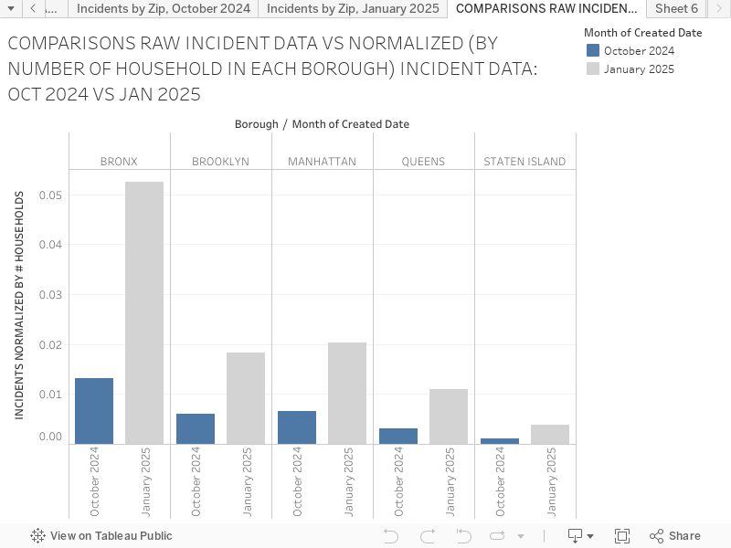
The chart below compares the per household incidences of no-heat complains for October 2024 and January 2025 for each Borough. Here again, the seriousness of the no-heat challenge in the Bronx is easy to see, especially during the peak winter month of January where one in 20 households in Bronx appears to call 311 for the lack of heat problems, while the number is one in 50 or less for other Boroughs.
Why is Bronx showing much more serious no-heat problems for its residents? I plan to address this question sometime in the near future.
<script type='text/javascript'> var divElement = document.getElementById('viz1742317678071'); var vizElement = divElement.getElementsByTagName('object')[0]; vizElement.style.width='100%';vizElement.style.height=(divElement.offsetWidth*0.75)+'px'; var scriptElement = document.createElement('script'); scriptElement.src = 'https://public.tableau.com/javascripts/api/viz_v1.js'; vizElement.parentNode.insertBefore(scriptElement, vizElement); </script>
After getting my MBA way back, I have been working for financial services companies, primarily as a risk analyst of sorts. After 45+ years of ups and downs and experiencing increasingly complex financial market risk stresses, I woke up one day and suddenly realized I still did not know what I wanted to do when I grew up.
The fact that I have lasted so many years in the intensely competitive environment meant I have done OK throughout these years, but I also recognized that what some elements of the work I do are much more fun and thus enjoyable than the others.
Looking forward, I would like to focus more on the elements of risk and financial analysis that I think would be “fun and hopefully life enhancing”, as opposed to “accurate, short-term optimizing and high-performance.” …and here, I would like to take advantage of the new toys– statistical and data visualization tools and methodologies– that I am learning as a part of getting an MS degree in Data Visualization and Analysis at CUNY Graduate Center.
I would like to explore what I mean by fun and enriching risk and economic assessments throughout this blog!
Need help with the Commons?
Email us at [email protected] so we can respond to your questions and requests. Please email from your CUNY email address if possible. Or visit our help site for more information: